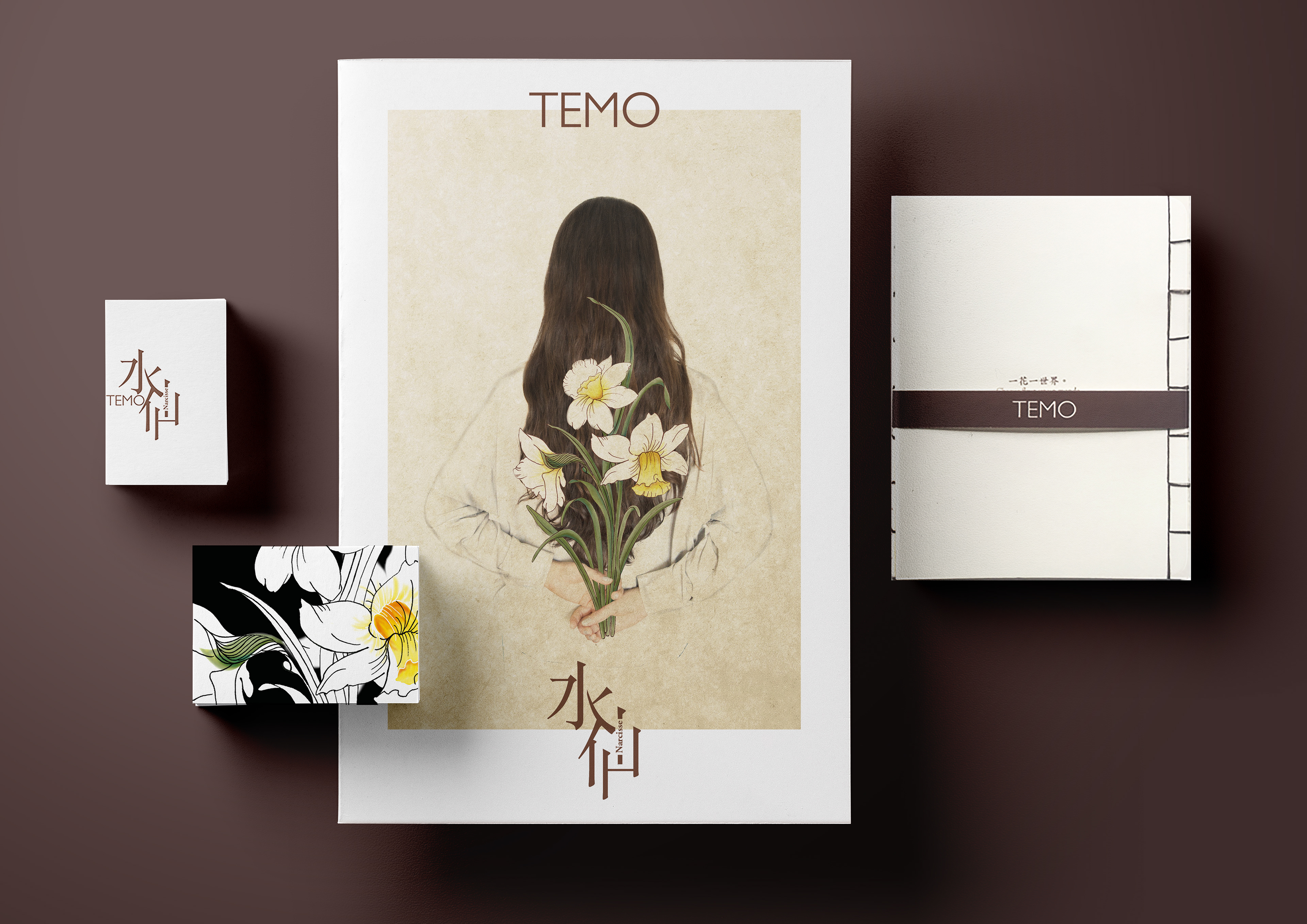
The font Gill Sans for logo, because its simple typeface, with straight lines, the M is slight different.
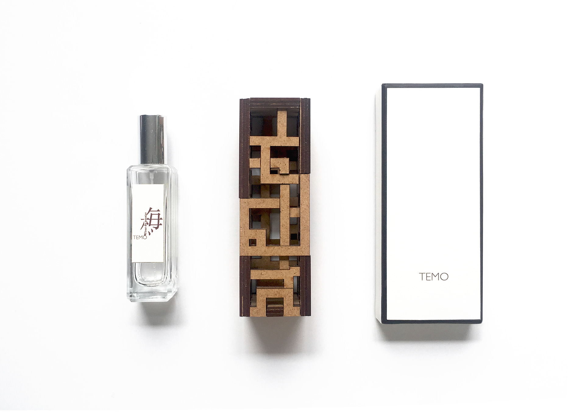
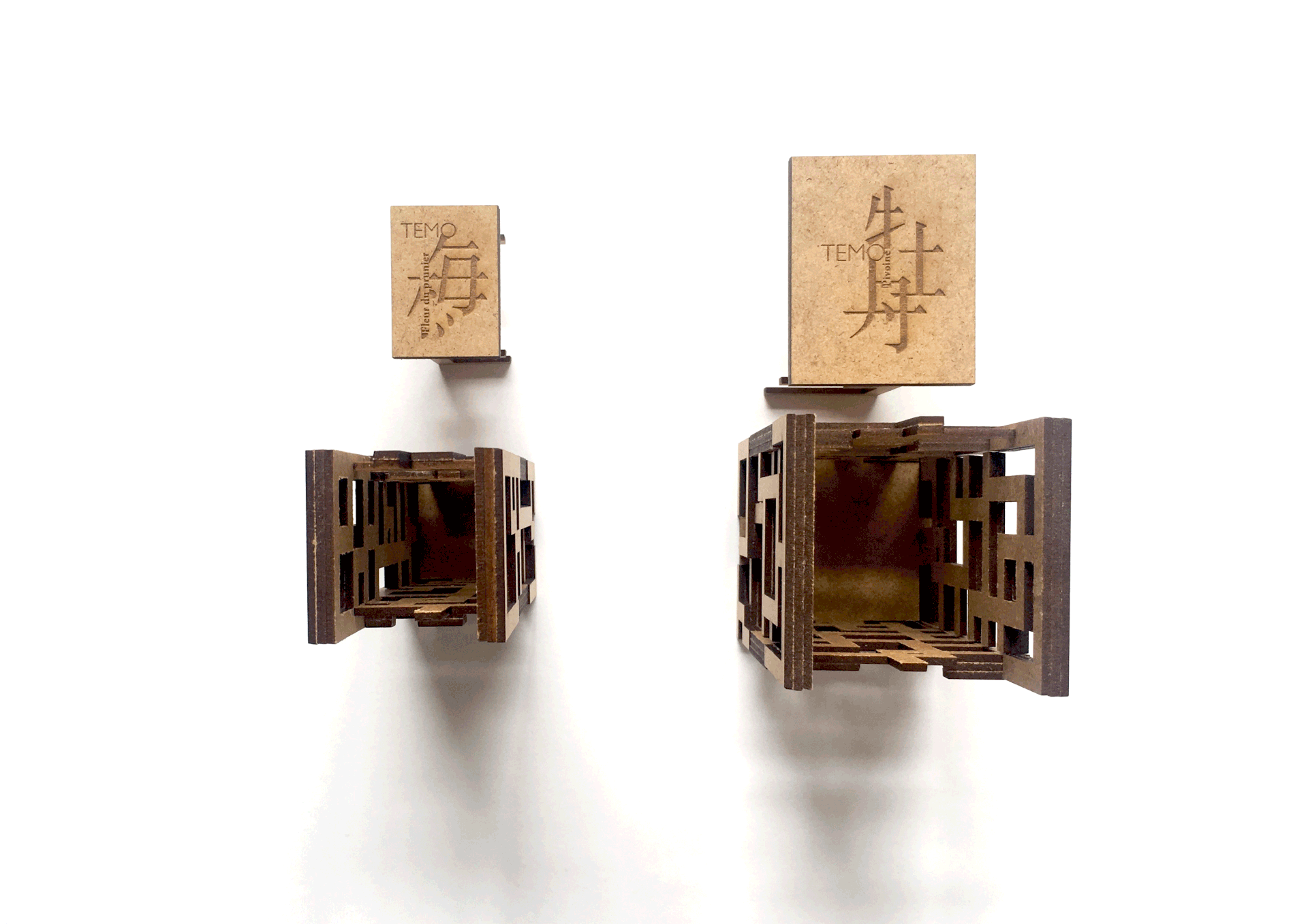
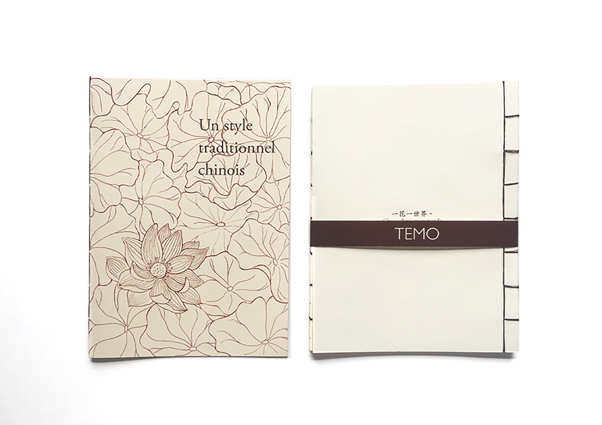
The packaging
-
Created by using the feature of Chinese mortise and tenon joint,
and the patterns of the packaging are inspired by ancient Chinese windows.
The packaging has 3 levels.
To open the packaging you have to move the cover towards ourself,
because it is the same hand movement when we smell perfume.
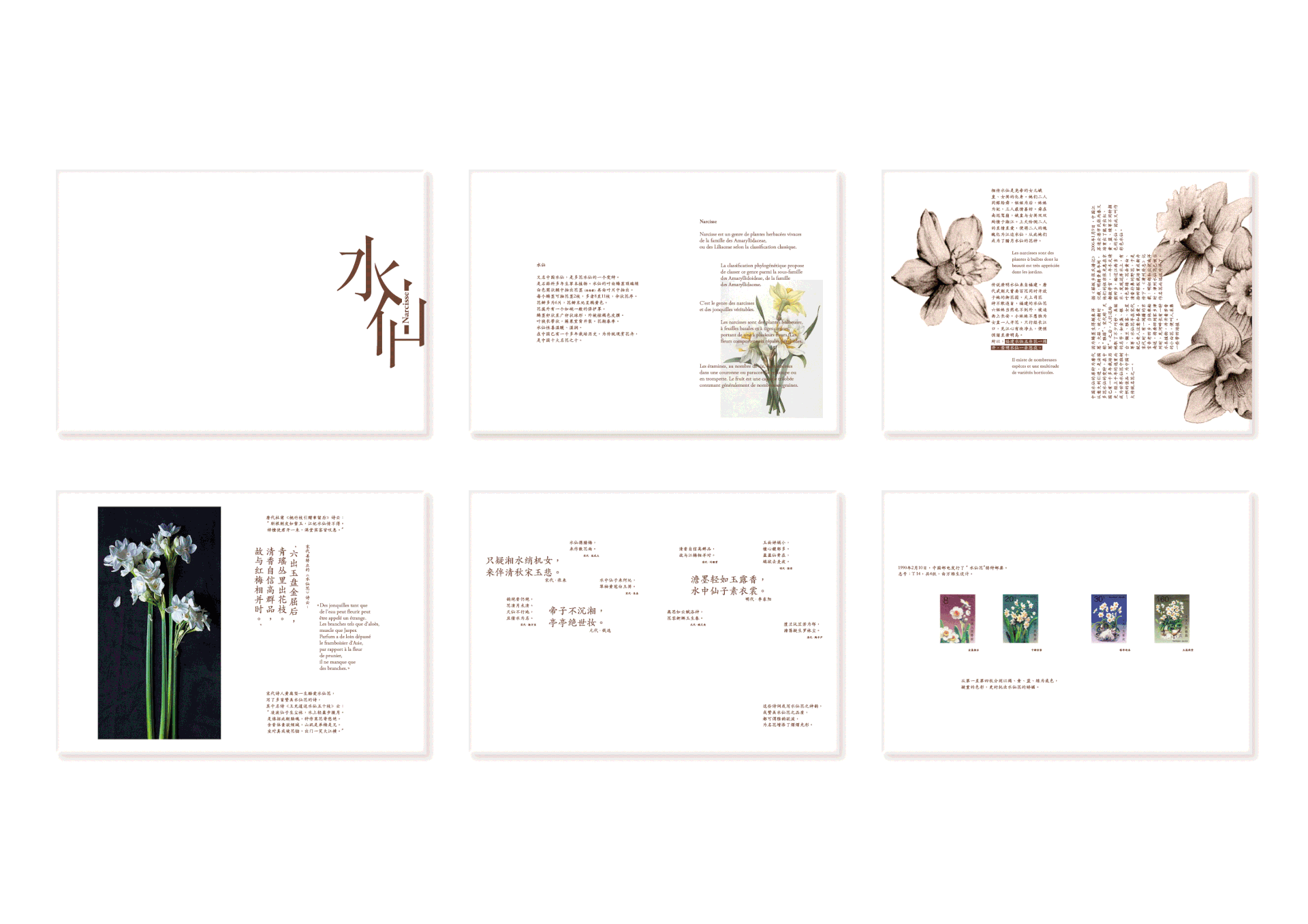
Press release
-
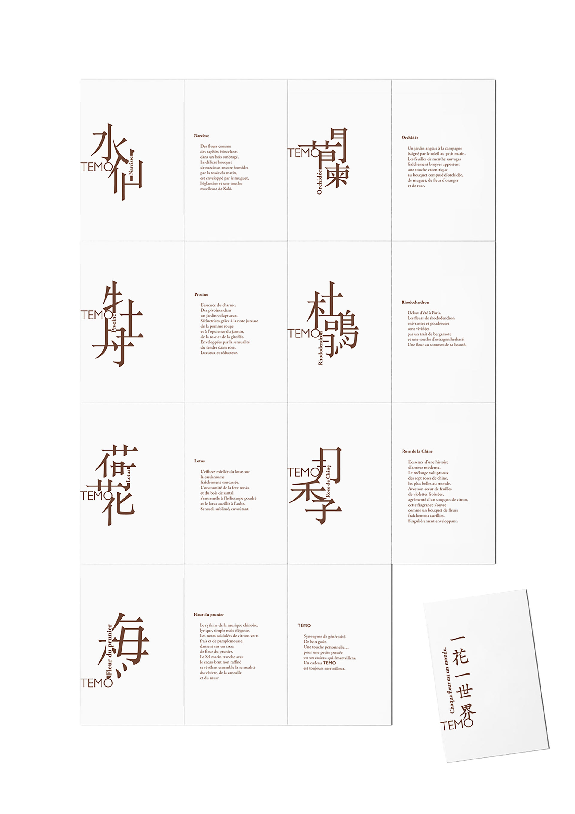
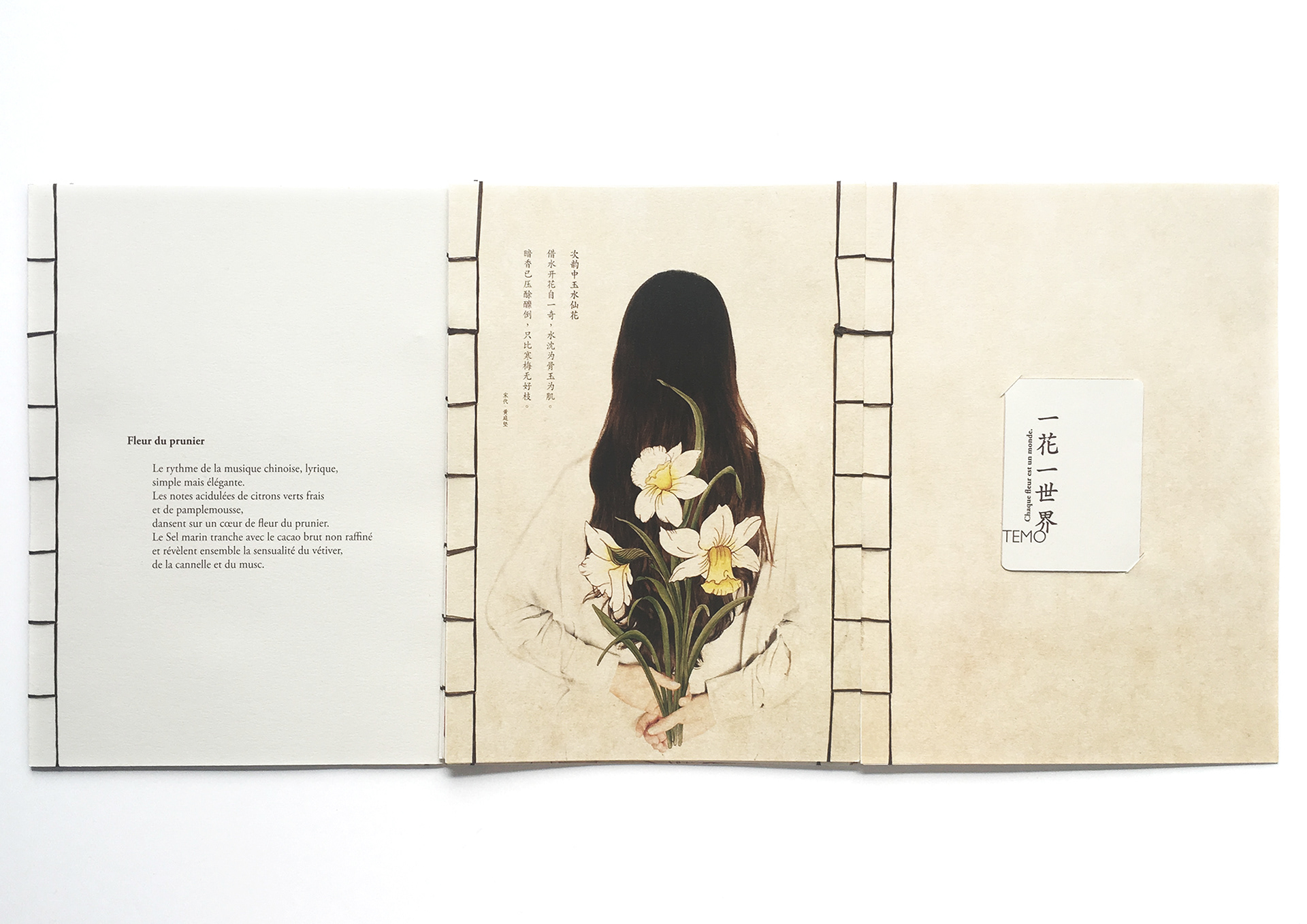
In order to present the feature of perfume,
I used two elegant fonts, typeface Kaiti for Chinese textes and typeface Adobe Garammond Pro for french textes.
I deconstructed the Chinese characters who symbolize flower in keeping with the feature of a Chinese mortise and tenon joint.
Then I added the French textes to the Chinese character.